Solve a real-world churn problem with Machine learning (including a detailed case study)
Apr 22, 2021 00:00 · 2495 words · 12 minute read
Use R & Tidyverse to develop a churn management strategy
Churn definition
Customer churn is a major problem for most companies. Losing customers requires gaining new customers to replace them. This could be around 10X more expensive than retaining existing customers, depending on the domain.
A customer is considered churn when he/she stops using your company’s product or service. This is easy to define for a contractual setting, as a customer is considered as churn when fails to renew the contract. But in a non-contractual setting, there aren’t clear rules for defining churn. In most of these cases, business users with extended domain knowledge work together with data scientists/data analysts to define what is considered to be churn in the specific problem. For example, in a retail organization, the team could define that a customer is a churn when he fails to purchase anything in the last 4 months.
Benefits of churn management
The main benefit is increased revenue by obtaining higher retention rates and customer satisfaction. The other benefit is the optimization of marketing expenditures with targeted marketing campaigns & reallocation of marketing budgets.
Churn rate
You can calculate the churn rate by dividing the number of customers we lost during a specific period — say a quarter or a year — by the number of customers we had at the beginning of that period.
For example, if we start the quarter with 400 customers and end with 380, our churn rate is 5% because we lost 5% or 20 of our customers.
Our churn problem
Our case study is a bank that wants to develop a churn model to predict the probability of a customer to churn. The banking sector has become one of the main industries in developed countries. The technical progress and the increasing number of banks raised the level of competition. Banks are working hard to survive in this competitive market depending on multiple strategies.
Three main strategies have been proposed to generate more revenues:
- Acquire new customers
- Upsell the existing customers (persuade a customer to buy something additional or more expensive)
- Increase the retention period of customers
In our case, we focus on the last strategy i.e. increase the retention period of customers. The original dataset is public and can be found at kaggle
Import libraries
At first we are loading all libraries.
library(tidyverse)
library(ggthemes)
library(correlationfunnel)
library(knitr)
library(caret)
library(recipes)
library(yardstick)
library(DT)

# Set the black & white theme for all plots
theme_set(theme_bw())
Load dataset
We use the read_csv() function (from readr library) to read the csv file in R.
bank <- read_csv(file = "/Users/manos/OneDrive/Projects/R/All_Projects/Churn/data/Churn_Modelling.csv")

bank <-
  bank %>%
  mutate(Churn = if_else(Exited == 0, "No", "Yes"),
         HasCrCard = if_else(HasCrCard == 0, "No", "Yes"),
         IsActiveMember = if_else(IsActiveMember == 0, "No", "Yes")) %>%
  select(- RowNumber, -CustomerId, - Surname, -Exited)
Inspect the dataset
Use glimpse() function to inspect the dataset.
bank %>% glimpse()## Rows: 10,000
## Columns: 11
## $ CreditScore <dbl> 619, 608, 502, 699, 850, 645, 822, 376, 501, 684, 528…
## $ Geography <chr> "France", "Spain", "France", "France", "Spain", "Spai…
## $ Gender <chr> "Female", "Female", "Female", "Female", "Female", "Ma…
## $ Age <dbl> 42, 41, 42, 39, 43, 44, 50, 29, 44, 27, 31, 24, 34, 2…
## $ Tenure <dbl> 2, 1, 8, 1, 2, 8, 7, 4, 4, 2, 6, 3, 10, 5, 7, 3, 1, 9…
## $ Balance <dbl> 0.00, 83807.86, 159660.80, 0.00, 125510.82, 113755.78…
## $ NumOfProducts <dbl> 1, 1, 3, 2, 1, 2, 2, 4, 2, 1, 2, 2, 2, 2, 2, 2, 1, 2,…
## $ HasCrCard <chr> "Yes", "No", "Yes", "No", "Yes", "Yes", "Yes", "Yes",…
## $ IsActiveMember <chr> "Yes", "Yes", "No", "No", "Yes", "No", "Yes", "No", "…
## $ EstimatedSalary <dbl> 101348.88, 112542.58, 113931.57, 93826.63, 79084.10, …
## $ Churn <chr> "Yes", "No", "Yes", "No", "No", "Yes", "No", "Yes", "…Below there is a detailed description of all variables of the dataset
- CreditScore | A credit score is a number between 300–850 that depicts a consumer’s creditworthiness. The higher the score, the better a borrower looks to potential lenders
- Geography | Customer’s country
- Gender | Customer’s gender
- Age | Customer’s age
- Tenure | Number of years for which the customer has been with the bank
- Balance | Customer’s current balance
- NumOfProducts | Number of bank products the customer is utilizing
- HasCrCard | Whether or not has a credit card
- IsActiveMember | Whether or not the customer is an active member
- EstimatedSalary | The estimated salary of the customer
- Churn | Whether or not the customer churned
Check for missing values
One of the most common problems in any data analysis is to discover & handle missing data.
bank %>%
    map_df(~ sum(is.na(.))) %>%
    gather() %>%
    arrange(desc(value))
## # A tibble: 11 x 2
## key value
## <chr> <int>
## 1 CreditScore 0
## 2 Geography 0
## 3 Gender 0
## 4 Age 0
## 5 Tenure 0
## 6 Balance 0
## 7 NumOfProducts 0
## 8 HasCrCard 0
## 9 IsActiveMember 0
## 10 EstimatedSalary 0
## 11 Churn 0There aren’t any missing values.
Check the levels of categorical/text variables
Now we want to check the levels of all categorical variables.
bank %>%
  summarise_if(is.character, n_distinct) %>%
  t()
## [,1]
## Geography 3
## Gender 2
## HasCrCard 2
## IsActiveMember 2
## Churn 2It looks that all character variables, are categorical variables with a few levels (2-3).
Categorical variables distribution
Now we want to check the distribution of categorical variables concerning churn.
bank %>%
  select_if(is.character) %>%
  gather(key = key, value = value, - Churn, factor_key = T) %>%
  ggplot(aes( x = value, fill = Churn)) +
  geom_bar() +
  facet_wrap(~key, scales = 'free') +
  scale_x_discrete(labels = abbreviate) +
  labs(
    title = 'Distribution of categorical variables in relation to churn',
    x = '') +
  scale_fill_economist()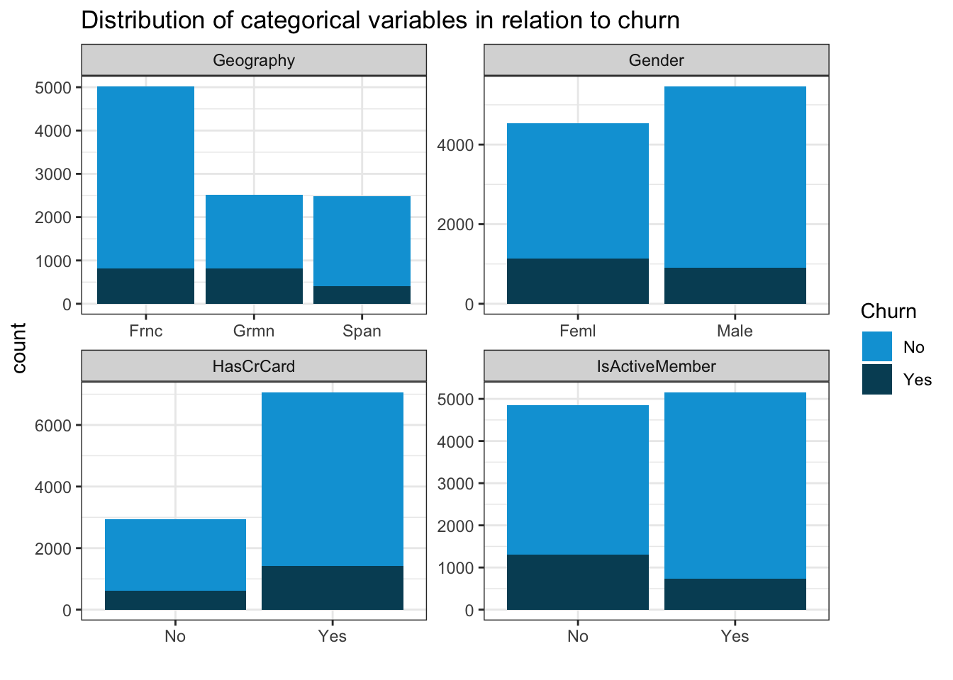
The main findings are:
- Customers from Germany are more likely to churn
- Male customers are slightly less likely to churn
- Active members are less likely to churn
Numerical variables distribution
Check the distribution of the numerical variables concerning churn.
bank %>%
  select_if(function(col) is.numeric(col) | all(col == .$Churn)) %>%
  gather(key = "Variable", value = "Value", -Churn) %>%
  ggplot(aes(Value, fill = Churn)) +
  geom_histogram(bins = 20) +
  facet_wrap(~ Variable, scales = "free") +
  labs(
    title = "Numerical variables histograms",
    x = ""
  ) +
  scale_fill_economist()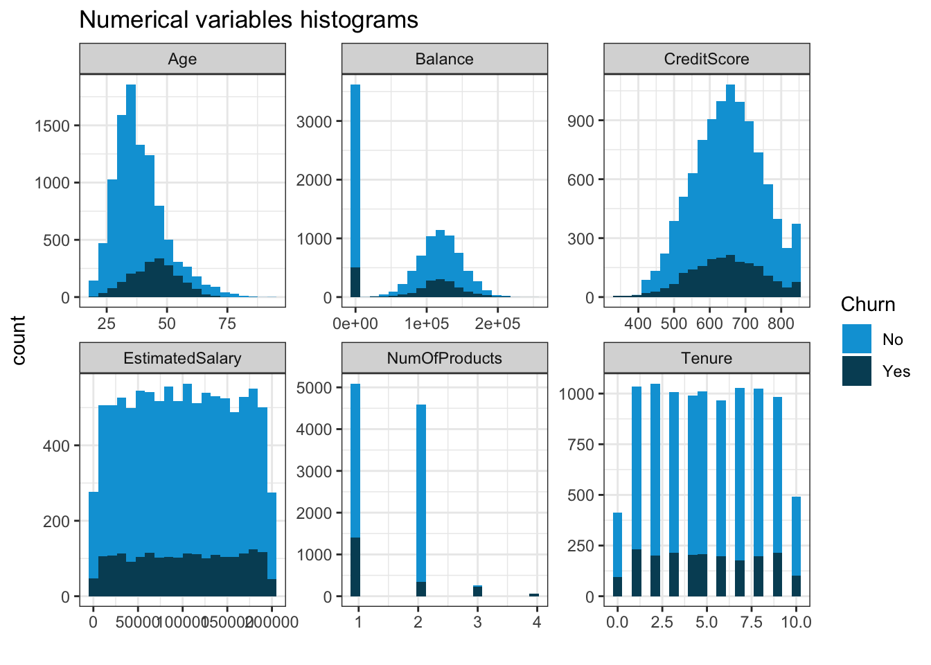
It seems that higher age means higher probability of churn
Correlation funnel
Correlation is a very important metric to understand the relationship between variables. The package correlationfunnel produces a chart, which helps us understand the relationship of all variables (categorical & numerical) with churn.
At first, it creates binary variables of each class of categorical variables and 4 bins of each numerical variable (based on quantiles). It plots all variables starting from the most correlated to the less correlated.
# Create correlation Funnel
bank %>%
  drop_na() %>%
    binarize() %>%
    correlate(Churn__Yes) %>%
    plot_correlation_funnel()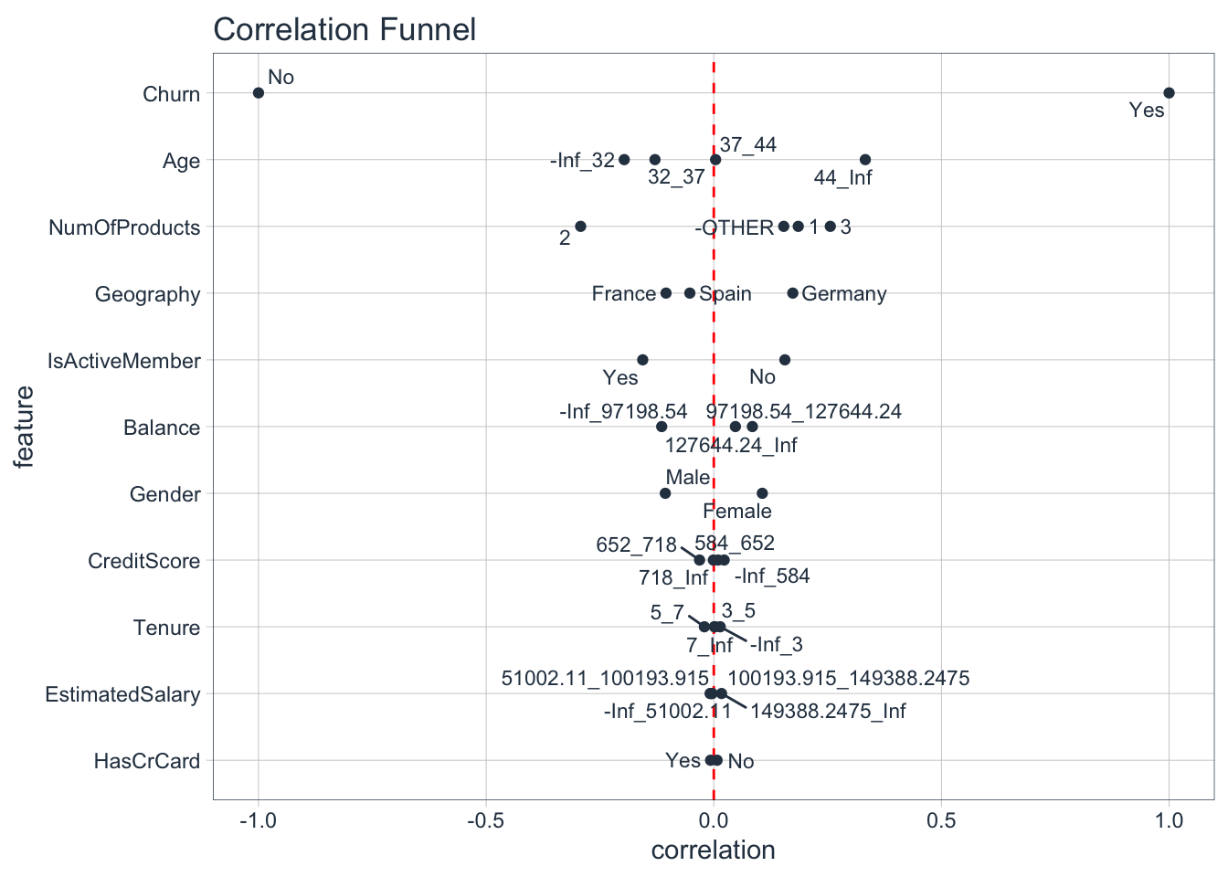
It looks like Age, Number of products, Geography & Member activity seem quite important. Balance & gender are less important. Credit score, tenure, estimated salary & credit card seem to be unimportant for churn, as almost all classes have near zero correlation.
MODELLING
Now we can go ahead and develop a machine learning model that will predict the churn probability for all customers.
Split dataset
At first, we’re splitting the dataset into 2 parts, the training & test dataset. We’ll use the training dataset to train our model & the testing dataset to check the performance of the model.
# Split the dataset in two parts
set.seed(1)
inTrain = createDataPartition(bank$Churn, p = .70)[[1]]

# Assign the 70% of observations to training data
training <- bank[inTrain,]

# Assign the remaining 30 % of observations to testing data
testing <- bank[-inTrain,]
Prepare the recipe of data for modelling
Here we’re using the recipes package to apply the same pre-processing steps to training & test data.
# Create the recipe object
recipe_obj <-
  recipe(Churn ~ ., data = training) %>%
  step_zv(all_predictors()) %>%       # check any zero variance features
  step_center(all_numeric()) %>%
  step_scale(all_numeric()) %>%         # scale the numeric features
  prep()
Processing data according the recipe
train_data <- bake(recipe_obj, training)

test_data  <- bake(recipe_obj, testing)
Setting the train controls for modelling
We’re using TrainControl() function to specify some parameters during model training, e.g. the resampling method, number of folds in K-Fold etc.
train_ctr <- trainControl(method = 'cv',
                          number = 10,
                          classProbs = TRUE,
                          summaryFunction = twoClassSummary)
Develop multiple machine learning models
Develop a logistic regression model
Logistic_model <- train(Churn ~ .,
                        data = train_data,
                        method = 'glm',
                        family = 'binomial',
                        trControl = train_ctr,
                        metric = 'ROC')
Develop a random forest model
rf_model <- train(Churn ~ .,
                  data = train_data,
                  method = 'rf',
                  trControl = train_ctr,
                  tuneLength = 5,
                  metric = 'ROC')
Develop an XGBoost model
xgb_model <- train(Churn ~ ., data = train_data,
                        method = 'xgbTree',
                        trControl = train_ctr,
                        tuneLength = 5,
                        metric = 'ROC')
Now we can save all models in a single file
save(Logistic_model, rf_model, xgb_model, file = "/Users/manos/OneDrive/Projects/R/All_Projects/Churn/data/ml_models_bank.RDA")We can load all trained models
load(file = "/Users/manos/OneDrive/Projects/R/All_Projects/Churn/data/ml_models_bank.RDA")Model Comparison
In this step, we’ll compare the models’ accuracy.
model_list <- resamples(list(Logistic = Logistic_model,
                             Random_forest = rf_model,
                             XgBoost = xgb_model))

summary(model_list)
##
## Call:
## summary.resamples(object = model_list)
##
## Models: Logistic, Random_forest, XgBoost
## Number of resamples: 10
##
## ROC
## Min. 1st Qu. Median Mean 3rd Qu. Max. NA's
## Logistic 0.7310692 0.7629073 0.7713738 0.7685092 0.7793850 0.7893184 0
## Random_forest 0.8257989 0.8573118 0.8669290 0.8653269 0.8735644 0.8900139 0
## XgBoost 0.8445059 0.8651163 0.8716812 0.8717819 0.8818719 0.8984382 0
##
## Sens
## Min. 1st Qu. Median Mean 3rd Qu. Max. NA's
## Logistic 0.9408602 0.9573794 0.9605027 0.9612578 0.9654857 0.9820789 0
## Random_forest 0.9425494 0.9546864 0.9631957 0.9608965 0.9681900 0.9802513 0
## XgBoost 0.9498208 0.9609515 0.9641577 0.9648430 0.9677275 0.9784946 0
##
## Spec
## Min. 1st Qu. Median Mean 3rd Qu. Max. NA's
## Logistic 0.1818182 0.2126465 0.2245395 0.2307003 0.2376761 0.3076923 0
## Random_forest 0.3732394 0.4534128 0.4825175 0.4803211 0.5131119 0.5594406 0
## XgBoost 0.4265734 0.4797843 0.4964789 0.4902098 0.5034965 0.5524476 0- Based on ROC (AUC value) the best model is XgBoost. The AUC value of the best model (mean of logistic regression) is 0.87. In general, models with an AUC value > 0.7 are considered as useful, depending of course on the context of the problem.
Model evaluation
# Predictions on test data
pred_logistic <- predict(Logistic_model, newdata = test_data, type = 'prob')

pred_rf <- predict(rf_model, newdata = test_data, type = 'prob')

pred_xgb <- predict(xgb_model, newdata = test_data, type = 'prob')


evaluation_tbl <- tibble(true_class     = test_data$Churn,
                         logistic_churn = pred_logistic$Yes,
                         rf_churn       = pred_rf$Yes,
                         xgb_churn      = pred_xgb$Yes)

evaluation_tbl
## # A tibble: 2,999 x 4
## true_class logistic_churn rf_churn xgb_churn
## <fct> <dbl> <dbl> <dbl>
## 1 Yes 0.125 0.276 0.297
## 2 No 0.234 0.178 0.0503
## 3 Yes 0.289 0.758 0.997
## 4 No 0.112 0.158 0.0631
## 5 No 0.0600 0.002 0.0139
## 6 No 0.160 0.006 0.0324
## 7 No 0.0991 0.002 0.0349
## 8 No 0.0669 0.042 0.0267
## 9 No 0.232 0.164 0.246
## 10 No 0.0311 0.056 0.0181
## # … with 2,989 more rowsRoc curve
ROC curve or receiver operating characteristic curve is a plot that illustrates the diagnostic ability of a binary classifier system as its discrimination threshold is varied.
i.e. how well the model predicts at different thresholds
# set the second level as the positive class
options(yardstick.event_first = FALSE)

# creating data for ploting ROC curve
roc_curve_logistic <- roc_curve(evaluation_tbl, true_class, logistic_churn) %>%
  mutate(model = 'logistic')

roc_curve_rf <- roc_curve(evaluation_tbl, true_class, rf_churn) %>%
  mutate(model = 'RF')

roc_curve_xgb <- roc_curve(evaluation_tbl, true_class, xgb_churn) %>%
  mutate(model = 'XGB')

# combine all the roc curve data
roc_curve_combine_tbl <- Reduce(rbind, list(roc_curve_logistic, roc_curve_rf,
                                            roc_curve_xgb))

head(roc_curve_combine_tbl,10)
## # A tibble: 10 x 4
## .threshold specificity sensitivity model
## <dbl> <dbl> <dbl> <chr>
## 1 -Inf 0 1 logistic
## 2 0.0115 0 1 logistic
## 3 0.0118 0.000419 1 logistic
## 4 0.0134 0.000838 1 logistic
## 5 0.0137 0.00126 1 logistic
## 6 0.0141 0.00168 1 logistic
## 7 0.0144 0.00209 1 logistic
## 8 0.0149 0.00251 1 logistic
## 9 0.0152 0.00293 1 logistic
## 10 0.0154 0.00293 0.998 logistic# Plot ROC curves
roc_curve_combine_tbl %>%
ggplot(aes(x = 1- specificity, y = sensitivity, color = model))+
geom_line(size = 1)+
geom_abline(linetype = 'dashed')+
scale_color_tableau()+
labs(title = 'ROC curve Comparison',
x = '1 - Specificity',
y = 'Sensitivity')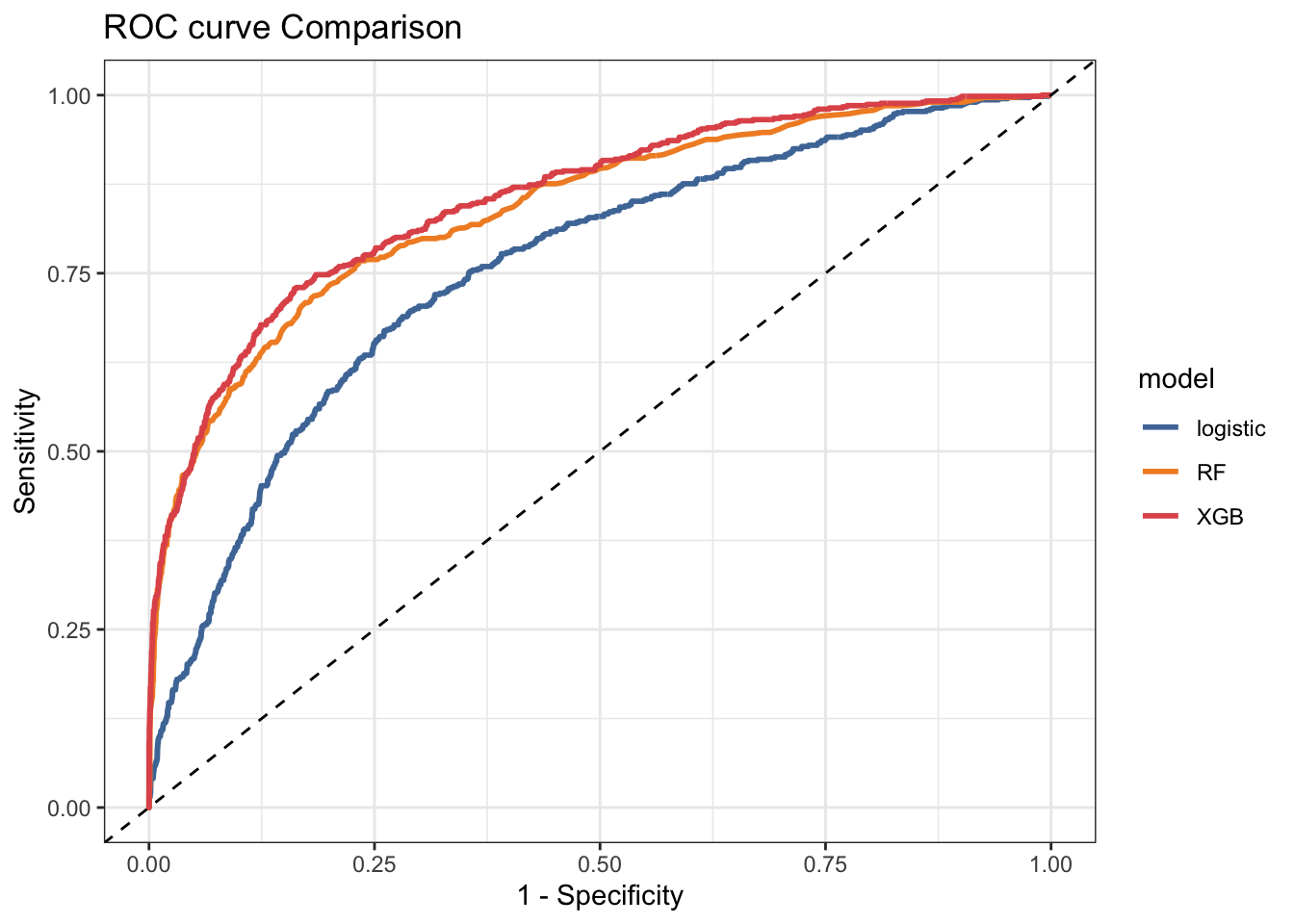
The largest the AUC value, the better is the model accuracy.
Feature Importance
It is important to understand how a model works, especially in a case of a churn model. A common measure that is used is the global feature importance. It measures the contribution of each variable towards the churn prediction.
This importance is calculated explicitly for each attribute in the dataset, allowing attributes to be ranked and compared to each other. Importance is calculated for a single decision tree by the amount that each attribute split point improves the performance measure, weighted by the number of observations the node is responsible for. The feature importances are then averaged across all of the decision trees within the model.
ggplot(varImp(xgb_model)) +
labs(title = "Feature Importance for XGBoost churn model") 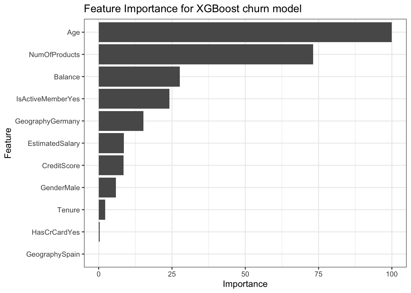
It seems that the top 2 most important feature are:
- Age
- Number of products
Predict churn for new customers
When we want to run predictions on customers we can follow the process below.
new_data <- read_csv(file = "/Users/manos/OneDrive/Projects/R/All_Projects/Churn/data/new_data_bank.csv")

new_data_recipe  <- bake(recipe_obj, new_data)

new_dat_pred <-
  predict(Logistic_model, newdata = new_data_recipe, type = 'prob') %>%
  select(Yes) %>%
  rename(churn_prob = Yes) %>%
  bind_cols(new_data) %>%
  mutate(churn_group = ntile(churn_prob, n = 10)) %>%
  select(churn_prob, churn_group, everything()) %>%
  mutate(churn_prob = round(churn_prob, 2))

new_dat_pred %>%
  select(churn_prob, churn_group, Age, NumOfProducts, Geography, HasCrCard, Tenure) %>%
  head(10) %>%
  kable() %>%
kableExtra::kable_styling()| churn_prob | churn_group | Age | NumOfProducts | Geography | HasCrCard | Tenure |
|---|---|---|---|---|---|---|
| 0.17 | 6 | 30 | 1 | Germany | Yes | 5 |
| 0.10 | 4 | 33 | 1 | France | Yes | 4 |
| 0.26 | 8 | 44 | 2 | France | No | 3 |
| 0.38 | 9 | 45 | 1 | Germany | Yes | 1 |
| 0.08 | 3 | 31 | 1 | France | Yes | 4 |
| 0.13 | 5 | 43 | 1 | France | Yes | 0 |
| 0.07 | 2 | 38 | 1 | Spain | Yes | 9 |
| 0.07 | 3 | 29 | 2 | Spain | Yes | 9 |
| 0.06 | 2 | 33 | 2 | France | Yes | 6 |
| 0.19 | 7 | 38 | 2 | Spain | Yes | 10 |
Create a churn risk ranking
Although we developed a model that can predict pretty well if a customer will churn, the model output probabilities are not sufficient in the business context. We need some metric that will be understood & easily used by all stakeholders and remove the complexities of e.g. explaining a threshold to non-technical stakeholder.
So instead of an actual probability, a churn risk ranking would be more useful. So we break up the probabilities variable into 10 churn risk buckets. Now a customer has a churn risk from 1 (lowest probability) to 10 (highest probability) .
Tactics for churn prevention
An initial tactic is to develop different sales offers (or marketing campaigns) for the different churn risk groups.
For example, customers that belong in churn risk groups 10 & 9 have a significantly higher churn risk than for example 1 & 2. So it will be crucial to offer them something more to retain them.